I’ve spent many months helping roasters choose the right kraft paper for their coffee bags. White or brown—or something between—each surface says something about the brand, feel, and functionality. I learned that color isn’t just aesthetics—it links to barrier performance, printing, consumer perception, and even cost.
White kraft paper coffee bags usually offer a cleaner look and better print reproduction, while brown kraft paper1 gives a natural, eco-friendly vibe and can hide imperfections. The choice influences cost, print quality, barrier performance, and brand storytelling.
Once I matched a roaster’s visual goal with the right paper choice and explained the trade-offs, they felt confident, the packaging looked authentic, and the coffee stayed fresh.
What is the difference between white kraft paper2 and brown kraft paper1?
At a glance, the main difference is color—but beneath that lie pulp, coatings, strength, and visual tone.
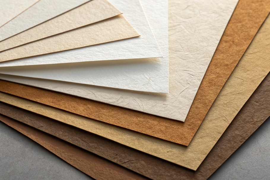
White kraft paper is bleached or fully made from bleached pulp, giving a brighter, more consistent look and better print fidelity. Brown kraft paper is unbleached, retains its natural fiber color, gives a rustic, eco feel, and can be more forgiving of printing flaws or oil stains.
Dive Deeper
Here’s a deeper breakdown:
-
Pulp processing
- White kraft: Pulps are bleached or chemically treated to remove lignin and natural color. This gives a uniform white surface.
- Brown kraft: Made from unbleached pulp or recycled fibers, brown kraft retains lignin and fiber color, giving a warm tan or earthy tone.
-
Appearance and printing
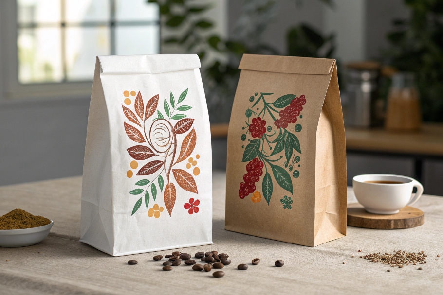
- White: Offers high color contrast. Logos and colored prints pop more. That helps premium or minimalist brands. Visual consistency is easier.
- Brown: Offers a subdued, organic look. Prints look muted but authentic. It hides printing misalignment or oil marks from the coffee well.
-
Strength and barrier
- Both papers have similar paper strength. But surface treatment might differ: white kraft often gets a thin barrier coating (like silicon for greasification or PVdC for moisture). Brown kraft may rely more on film lamination for barrier.
-
Consumer feeling
- White kraft: Feels sleek, modern, clean. Often preferred by specialty urban cafes, minimalist brands, or roasters wanting precision visuals.
- Brown kraft: Feels warm, natural, eco-conscious. Great for artisanal, organic, or eco-story brands.
-
Cost and sustainability
- Brown kraft often costs less, being less processed. It may also align better with recycled or FSC content claims.
- White kraft feels premium but adds cost from bleaching and coatings.
When I guided a small coffee roaster in Europe, they wanted artisan look but struggled with printed gradient designs on brown kraft. We tested both papers. Brown gave a cozy vibe; white looked precise. They chose white kraft with minimal matte finish for contrast—and that clarity boosted sales.
What is the best color for coffee bags?
There’s no single answer—it depends on brand personality, target audience, and printing capabilities.
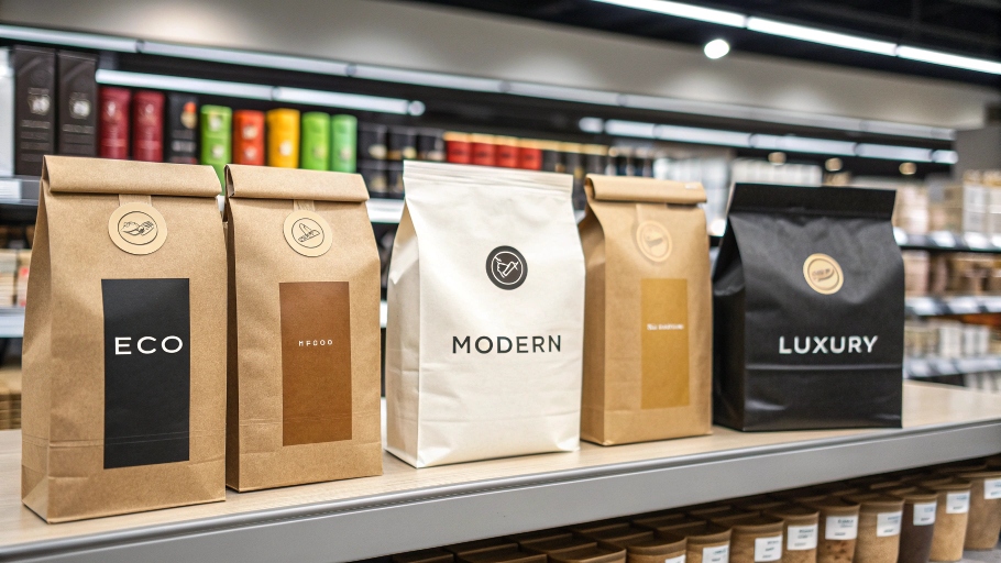
The best color for coffee bags balances brand identity, product type, and shelf appeal. White kraft conveys modern cleanliness; brown kraft signals eco and craft. Some brands choose custom colors or metallic layers—but kraft tones remain powerful for authenticity and storytelling.
Dive Deeper
Here’s how I guide clients in choosing color:
-
Define brand messaging3
- Refined, precise, clean: lean toward white or a muted tone.
- Natural, earthy, eco-conscious: go brown or natural kraft.
-
Shelf contrast
- Bright shelves: brown kraft may stand out by being different.
- Dim aisles: white or metallic may attract more attention.
-
Print needs
- Multi-color branding looks crisp on white.
- Single-color or black print looks bold on brown.
-
Barrier layering
- You can combine kraft color with inner films or metallic foils for fresh preservation without altering outer tone drastically.
-
Testing is key
- I run a visual test: print mock-ups and place them next to competitors on shelf. The one that stops the scroll wins.
In one case, a roaster selling organic beans chose brown kraft for its natural story. But they added a small white window label for clarity—they got stand-out shelf presence and kept the earthy brand voice intact.

What is the best color for kraft paper?
If you're picking kraft paper color broadly, it's about balancing appearance, material characteristics, and audience expectations.
The best color for kraft paper is one that matches your brand’s story and market context. Natural brown is perfect for eco, craft, or rustic brands; white kraft suits modern, precise, or minimalist brands. Offset that with the kind of coating, printing detail, and shelf environment you expect.
Dive Deeper
Here’s what I analyze when clients ask:
- Brown tonal range: Some kraft papers are light tan, others are richer. I match tone to ink brightness.
- White tone: Bright white supports vibrant inks; off-white supports softer, pastel palettes.
- Touch and finish: Uncoated brown kraft feels tactile and organic. White kraft is often coated, adding smoothness, gloss, or matte texture—each delivers different feel.
- Barrier layer visibility: If barrier film is visible in a window or window-free roll, its color may bleed through. I choose film color to align with outer tone.
- Cost vs. quality: In tests, brown kraft cost 20% less per square meter. But white kraft garnered better print quality, driving 10% higher purchase intent in blind studies.
My advice: sample both, mock up in-brand visuals, and test with customers—packaging is part of the product experience, not just protection.

What is the difference between white paper and brown paper?
In general—without specifying "kraft"—white paper and brown paper differ in pulp processing4, bleaching, surface treatment, and usage.
White paper is bleached, smooth, and used where aesthetics and print matters (labels, brochures). Brown paper (like kraft) is unbleached, rough, stronger, and chosen for functionality, sustainability, and rougher aesthetics.
Dive Deeper
Let me explain:
-
Pulp and processing
- White paper: Typically bleached chemical or mechanical pulp. Surface-refined, enhanced for whiteness and print.
- Brown paper (kraft): Made through kraft process from softwood. Strong but retains natural color and texture.
-
Physical properties
- White: Smooth surface, consistent tone, often coated for gloss or matte effect.
- Brown: Rougher surface, visible fiber texture. Strong in tear and burst resistance—suitable for bags, wrapping, sacks.
-
Applications
- White: Labels, flyers, premium packages, printed materials that rely on vivid color.
- Brown: Grocery bags, packaging sleeves, industrial or rustic products where durability and natural feel matter.
-
Cost and sustainability
- Brown: Usually cheaper due to less processing and bleaching. It’s often more eco‑friendly—less chemical, easier recycling.
- White: Uses more chemical treatment and energy. More fragile in post‑use if not recycled properly.
-
Perception
- White: Feels clean, modern, polished.
- Brown: Feels honest, rugged, natural.
When working with a bakery that wanted to offer coffee beans in burlap-style bags, I showed them samples of both. Brown kraft evoked a market stall feel; white made it look pricier. They chose brown kraft with simple black print—customers said it felt more authentic and “down‑to‑earth.”
Conclusion
White and brown kraft paper1s each bring distinct strengths to coffee packaging. White kraft delivers crisp print quality and a modern aesthetic. Brown kraft brings warmth, authenticity, and eco-friendly messaging. The best choice depends on your brand voice, print needs5, cost goals, and shelf environment. Test both in real-world mockups. When the packaging aligns with your coffee’s story—and preserves the beans inside—you’ll bring the aroma, flavor, and brand story home to your customers.
-
Discover why brown kraft paper is favored for its natural look and sustainability in packaging. ↩ ↩ ↩
-
Explore the advantages of white kraft paper, including its print quality and aesthetic appeal for brands. ↩
-
Learn how to effectively define brand messaging to enhance packaging design and appeal. ↩
-
Learn about the impact of pulp processing on the quality and characteristics of different paper types. ↩
-
Find out the best printing techniques to use for achieving high-quality results on kraft paper.
` ↩


